Visual Design for High‑Performance WordPress
Let’s make your WordPress site look great—and perform even better. We craft cohesive visual systems—layout, color, type, interactive states, and motion—that make your brand unmistakable and your site effortless to use. Then we build them into lean, fast, custom WordPress themes that grow with you and your marketing.
- Book a 20‑minute consult (no pressure—talk directly with our St. Louis team)
- Request a free visual audit (we’ll highlight quick wins and risks)
- Ask for example component libraries
Custom, hand‑coded, and scalable. We never use stock themes or bloated page builders—fewer plugins, more control, no lock‑in. Work directly with our St. Louis team. We collaborate smoothly with in‑house marketers and branding agencies to keep projects moving and on‑brand.
Our WordPress‑first approach is accessible by default (WCAG 2.2 AA) and tuned for Core Web Vitals. Designs become dev‑ready components and measurable results—faster loads, clearer content, and a user experience that converts. Ready to explore what that looks like for your site? Let’s talk.
Trusted by teams who need design that ships clean
From in‑house marketing teams to brand studios, organizations choose STL CodeScape when they need design that moves cleanly into WordPress—fast, accessible, and ready to scale. Bring us your Figma and design system tokens; we’ll return a lean, custom theme that ships without guesswork and doesn’t rely on bloated page builders.
Selected partners include a Midwest healthcare network, a regional credit union, a B2B manufacturer, a city tourism bureau, a university program, and multiple branding agencies that want a reliable dev handoff. References available on request; we’re NDA‑friendly and comfortable with vendor onboarding.
“STL CodeScape turned our Figma into a lean WordPress theme with zero guesswork. Our team finally has a system we can scale.”
“Fast, collaborative, and meticulous. Devs loved the tokens and components, and we launched two weeks early.”
Recent launch outcomes
- 22–35% lower bounce on key landing pages within 60 days
- 12–20% more form submissions after a visual refresh and UX cleanup
- 30–40% fewer QA cycles thanks to clear component specs and acceptance criteria
- Core Web Vitals passed on new builds; mobile LCP targeted under 2.5s
Have designs in Figma? Request a no‑pressure buildability review and estimated timeline. Still in design? We’ll advise on tokens, components, and accessibility so dev goes smoother. Want proof? Ask for a redacted case study and sample component spec. Let’s make your visual system production‑ready. Here’s why visual design directly affects site performance and growth.
Why visual design matters for your website
First impressions are fast. Visual design signals quality and makes content easy to understand and act on. Done well, it builds trust, speeds decisions, and lowers the cost of running and evolving your site. If your current site isn’t doing that yet, we can help you get there without a full redesign.
- Trust at first glance: Consistent branding across headers, navigation, buttons, and icons; a clear spacing grid; optimized imagery; accessible color contrast; and purposeful micro‑interactions show polish before anyone reads a word. We audit and tune these details so your brand feels credible from click one.
- Readability that keeps people engaged: Clear type scales, sensible line lengths, generous white space, and familiar patterns (cards, lists, callouts) help visitors find what they need fast, leading to deeper reading—and more qualified inquiries.
- Clear paths to conversion: Visual hierarchy focuses on one primary action per view. Buttons are styled by priority, forms have intuitive labels and inline validation, and states (hover, focus, error, success, loading, empty) make each step obvious. The result: fewer drop‑offs and more completed forms. Considering chat as a helpful assist? See our Custom AI Chatbot Setup.
- Consistency across pages and devices: Tokenized color, typography, and spacing with reusable components and responsive rules keep interactions predictable from mobile to desktop. This reduces friction, prevents layout shifts and heavy assets, and keeps your site fast.
- Lower maintenance costs through a system: A documented design system mapped to Gutenberg blocks and patterns lets you update once and roll changes everywhere. Tokens flow to theme styles, cutting regressions, QA time, and custom CSS sprawl—so you can move faster with less overhead. Need experienced builders to implement? Meet our WordPress Specialists.
Not sure where to start? Ask for a quick, no‑obligation design review and we’ll highlight your highest‑impact fixes and how they map to a lean custom WordPress theme.
Next, see exactly what we design—your visual language, component library, and motion and accessibility rules—and how each piece maps to WordPress blocks, templates, and a lean custom theme. Want a short walkthrough tailored to your brand? Book a 20‑minute consult.
What we design (tailored to WordPress)
Everything we design fits a custom WordPress theme and the block editor, so it looks great, loads fast, and is easy to maintain—and, most importantly, helps visitors take action. If you already have brand guidelines or Figma files, we translate them into a performance‑ready WordPress system.
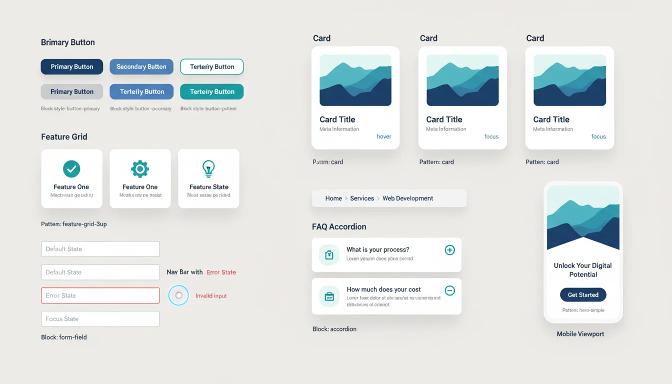
Visual language: color, typography, spacing, iconography, imagery
We define an accessible color system, type scales, and spacing rhythm mapped to tokens and CSS variables. Icons ship as SVGs. Imagery guidelines cover aspect ratios, crops, and WebP/AVIF across breakpoints—so your brand stays consistent everywhere. Want a quick accessibility check on your current palette? Ask us for a fast audit. Looking for web‑first brand visuals? Explore our Graphic Designer services.
Page and UI design: layouts, states, forms, navigation, micro‑interactions
We design core templates and key flows—home, services, blog, product or listing, and conversion pages—plus headers, footers, search, pagination, and 404 or empty states. Forms include error, success, and validation patterns. Interactions favor clarity and speed to reduce friction and increase conversions. Have data you want us to use? We’ll fold in analytics insights to prioritize what moves the needle—yes, we can set up Google Analytics and tracking to measure it.
Component and pattern library aligned to Gutenberg and blocks
Every component becomes a reusable block or pattern with content rules, variants, and responsive behavior, so editors can build pages without breaking the design. We plan for real content lengths and multilingual edge cases, and include clear usage notes so your team can hit the ground running. Already in Gutenberg? We can upgrade your current patterns for consistency. See how we turn patterns into themes in Theme Development.
Motion guidelines: tasteful animation, loading states, transitions
Subtle transitions, hover and focus feedback, and skeleton or loading patterns guide attention without hurting performance. Motion respects reduced‑motion preferences and stays within agreed performance budgets—delightful where it helps, invisible where it should be.
Accessibility built in (contrast, focus, keyboard flows, color usage)
WCAG 2.2 AA shapes contrast, target sizes, focus rings, headings and landmarks, and keyboard paths. We specify safe color pairs and interactive states from the start so compliance isn’t an afterthought—and more users convert.
Supporting marketing visuals: hero graphics, ad creatives, email modules
We create hero treatments, social and Open Graph images, ad sets, and email modules that match the site system, keeping campaigns consistent and driving traffic back. Need quick variants for a campaign test? We’ll supply ready‑to‑launch options. For ongoing content, see our AI Social Media Content and AI Product Videos.
Next, see how these decisions become a WordPress‑ready system—tokens, theme.json, block patterns, and specs that translate cleanly into your custom theme. Want to see a live example or get a ballpark for your project? Request a sample system or book a 20‑minute walkthrough.
How visuals plug into WordPress
Great visuals only matter if they survive the editor. We design the system to plug straight into a custom block theme so devs move faster and content teams stay on brand. Whether you’re handing us Figma or modernizing an existing site, we’ll make it dev‑ready and editor‑proof. Want a quick reality check? Ask for a no‑pressure token‑to‑theme.json sample on your brand.
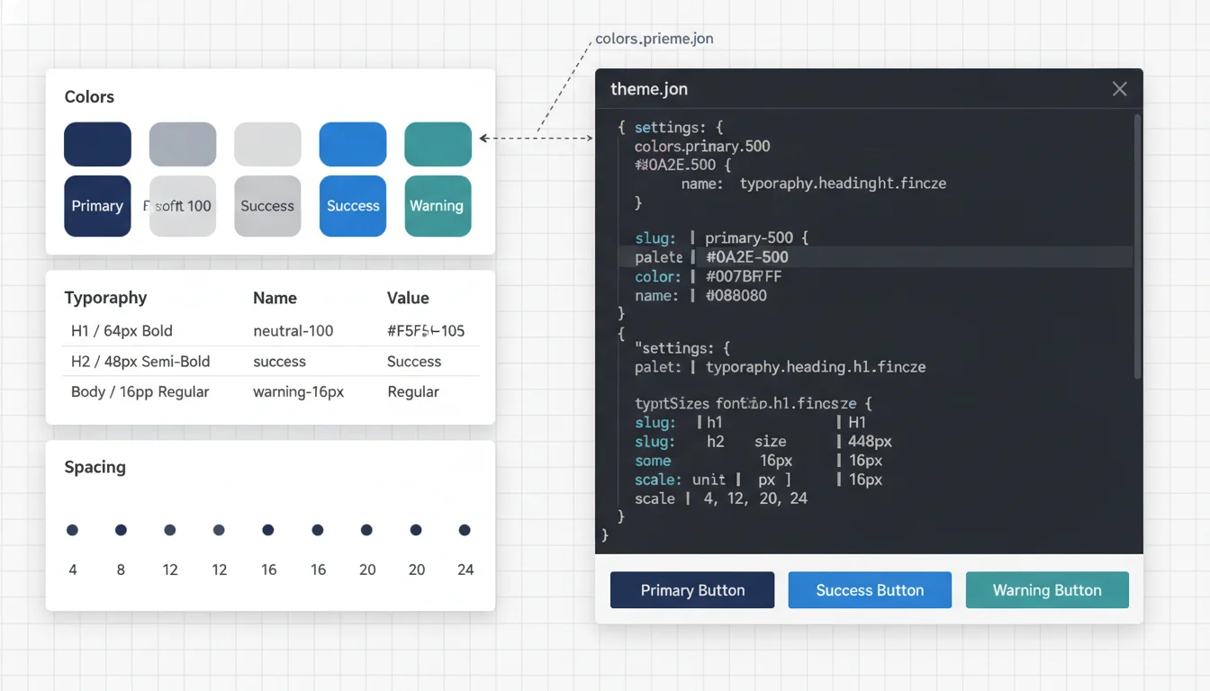
Design tokens mapped to theme.json (colors, typography, spacing)
- Color palette with semantic names (brand, neutral, state), gradients, and high‑contrast variants that meet WCAG 2.2 AA
- Type scale (fluid where useful), line heights, font stacks and weights, plus font‑loading guidance (subset, preload, swap)
- Spacing ramp, radii, borders, and shadows standardized as presets
- Delivered as a token set with a ready‑to‑merge theme.json and optional SCSS or CSS variables
- Want a preview? Send your Figma library and we’ll return a sample theme.json and token set you can diff with your team. If you need build help, explore Custom WordPress Theme Development.
Block styles, patterns, and template parts defined in design
- Core block styles documented with states (hover, focus, active, error), responsive rules, and variations
- Reusable patterns for common sections (hero, feature grid, cards, FAQs, CTAs, forms, pricing, footers) with names, slugs, and usage notes
- Template parts (headers, footers, sidebars) and page templates (landing, pillar article, blog index, single post) annotated for registration
- Prefer to see it live? We’ll demo how patterns drop into the Block Editor and how naming speeds up authoring—book a quick walkthrough.
Guidelines for custom blocks and editor controls
- When core patterns aren’t enough, we provide a mini spec: attributes, allowed InnerBlocks, supports flags, toolbar and sidebar controls, variations, and transforms
- Accessibility built in (focus order, ARIA needs, error messaging) plus empty or placeholder states for clean authoring
- Implementation notes for ACF and InnerBlocks or fully custom blocks, including when to render statically vs dynamically
- Not sure if you need a custom block or a composition of core blocks? We’ll recommend the lightest, maintainable path in a short architecture call.
Asset optimization directives (SVGs, responsive images, formats)
- SVG first for icons and illustrations with SVGO settings and optional sprite strategy
- Image crops and art‑direction guidance per breakpoint; required aspect ratios and safe areas
- Delivery formats and fallbacks (WebP or AVIF primary, JPEG or PNG fallback), srcset and sizes rules, lazy loading, decoding priority, and max file weights
- Motion guidance that respects reduced‑motion; when to prefer CSS over video or Lottie
- Want our checklist? Ask for the image/SVG performance guide we use in every handoff.
Editor experience notes so content teams can scale safely
- Global styles and editor restrictions: allowed blocks, locked patterns, and preset color and spacing only
- Pattern usage guidance and inline helper text, plus naming that makes inserter search intuitive
- Content governance tips (min and max copy lengths, alt‑text rules, heading hierarchy) and a quickstart guide or short Loom for handoff
- Role‑based recommendations (who edits patterns, who manages global styles)
- We include a Loom walkthrough and a role‑based permissions plan so your team can ship on day one—want the outline? We’ll send it.
With the mapping clear, the next section walks through our process from discovery to build support. Ready to see this in action on your brand? Book a 20‑minute walkthrough or share your Figma link for a no‑obligation mapping preview.
Our process: from discovery to pixel‑perfect build
A design you can ship without guesswork, built for WordPress from day one. Here’s how we go from idea to a production‑ready, pixel‑accurate site. If you want this mapped to your goals, grab a quick 20‑minute intro call at stlcodescape.com/contact and we’ll scope it together.
-
Discovery and goals
- Align on outcomes: lead or sales targets, demo bookings, content velocity, and Core Web Vitals goals (LCP under 2.5s, CLS under 0.1)
- Audit inputs: brand standards, analytics (GA4 and Search Console), past heatmaps, current performance, competitive landscape — we can also set up Google Analytics and other tracking if needed
- Define audiences, jobs to be done, sitemap priorities, and conversion paths
- Capture constraints: editorial workflow, required integrations (CRM, email, events), accessibility (WCAG 2.2 AA), legal or compliance, timeline, budget
- Output: success criteria and a measurement plan — ask for a sample measurement template to share internally
-
Wireframes and content hierarchy
- Low‑fidelity wireframes in Figma for key templates (home, service, blog, single, archive, landing), mobile‑first
- Clear hierarchy: messaging, navigation, CTAs, form placement, and content blocks mapped to Gutenberg patterns
- System foundations: grid, breakpoints (sm, md, lg, xl), spacing scale, and early focus and reading order for accessibility
- Output: annotated wireframes and a prioritized content model — want to see how we annotate? Request a one‑page example wireframe
-
Visual design and interaction specs in Figma
- Visual language: color roles with contrast checks, typography scale, spacing and elevation, iconography, illustration direction
- UI components mapped to WordPress blocks: hero variants, cards, CTAs, accordions, tabs, galleries, forms, tables, alerts, and messages with hover, active, focus, and disabled states
- Motion and micro‑interactions: durations, easing, and reduced‑motion alternatives
- Asset guidance: art direction for hero and media, image ratios, SVG or PNG usage, file size budgets
- Output: a cohesive UI kit with documented states and responsive behavior — we’re happy to walk you through a live Figma file; ask for a short demo
-
Prototype and validation
- Clickable prototype of primary flows (landing to form to thank‑you), including error, empty, and loading states
- Rapid validation: lightweight usability checks with stakeholders or 3–5 target users
- Accessibility review: keyboard traversal, screen reader happy paths, focus visibility, and color contrast against WCAG 2.2 AA
- Output: refined designs and a validation summary with priorities — bring your team to a 45‑minute readout and leave with clear next steps
-
Dev handoff: tokens, redlines, and acceptance criteria
- Tokens as a single source of truth: color, typography, spacing, radii, shadows mapped to theme.json and exported as CSS variables or SCSS
- Figma files ready for Inspect with redlines, component variants, responsive specs, and asset exports
- Block and pattern inventory aligned to Gutenberg: list of patterns, allowed blocks, custom block schema (ACF or block.json), and content types or taxonomies
- Accessibility notes: ARIA roles, name/role/value expectations, focus order, and form validation messaging
- Performance guardrails: image sizes and formats, icon strategy, font loading, motion budgets — for more on speed, see how we handle performance optimization and caching
- Pixel‑fidelity acceptance criteria:
- Layout tolerance within ±2 px at sm, md, lg, xl
- Type scale, line height, and spacing use defined tokens
- Interactive states and motion match documented timings and easing
- Core Web Vitals targets met on staging before launch sign‑off
- Output: a dev‑ready package plus tickets and checklists for your Git or Jira workflow (or ours) — want to see a sanitized handoff pack before you commit? We’ll share one on request. Also see: custom 404s and error handling
-
Build support and QA
- Paired reviews: designer and developer review each template and block as implemented; issues tracked and resolved in PRs
- Cross‑browser and device QA: latest Chrome, Safari, Firefox, Edge; iOS Safari; Android Chrome; common assistive tech checks
- Visual regression tests on key templates
- Performance and accessibility QA on staging using Lighthouse and WebPageTest plus automated and manual a11y scans
- Content load and editor training with real copy and media
- Output: production‑ready theme, launch checklist, and a post‑launch polish list — need help with launch week (DNS, redirects, analytics tagging)? We’ll handle it
Up next: see the exact files, libraries, and specs you receive at each phase. Or skip ahead and schedule a quick intro to review sample deliverables.
Deliverables you receive
You’ll know exactly what you’re getting, and your developers will know exactly how to use it. Every deliverable is production‑minded to reduce back‑and‑forth, lower risk, and speed up the WordPress build. Our design engagements ship with:
Figma files with pages, components, and variants
Organized by flows and templates with desktop, tablet, and mobile breakpoints, Auto Layout, variables, and clickable prototypes. Components include state variants (default, hover, focus, active, disabled, error, success) and content guidance (character counts, image crops).
Design tokens (JSON, CSS, SCSS, theme.json) ready for integration
A single source of truth for color, typography, spacing, radii, shadows, z‑index, motion, and breakpoints. We export tokens to JSON, map them to theme.json and CSS variables, and provide SCSS variables so editor and front‑end stay in sync.
Style guide and usage guidelines
Brand application, grid and spacing rules (4/8‑pt), typography pairings and hierarchy, imagery and illustration direction, icon rules, motion principles, and do/don’t examples.
Component and pattern library aligned to Gutenberg
A documented set of components and page patterns mapped to core or custom blocks and block styles. Each includes anatomy, permitted content, responsive behavior, empty, error, and loading states, plus example content. Ready to implement? See our Theme Development approach.
Redlines, specs, and interaction notes
Measurements, responsive constraints, and redlines for padding, gutters, and line lengths; interaction notes for focus, hover, press, keyboard behavior, and motion timing or easing. Includes acceptance notes for pixel parity by breakpoint.
Accessibility annotations and color or contrast matrix
WCAG 2.2 AA intent baked in: focus order, target sizes, error messaging patterns, ARIA and landmark hints, reduced‑motion alternatives, and a color pairing matrix with contrast ratios.
Optimized asset pack (SVGs, images, icons) with usage rules
SVG icon system, vector logos, and raster images pre‑cropped for responsive srcset with WebP or AVIF plus fallbacks. Includes naming, compression presets, OG or social share images, and favicon and app icon sets.
QA checklist and acceptance criteria
A build‑ready checklist covering editor vs front‑end parity, block accessibility, browser and device support, performance guardrails (for example, hero LCP media budget), visual regression baselines, and sign‑off criteria.
All source files are yours, versioned and organized for handoff—no lock‑in. The outcome: clearer tickets, fewer surprises, and a faster path to a stable, scalable WordPress build (by your team or ours).
Want to see how this looks in practice? Request a sample handoff pack or book a 15‑minute walkthrough—we’ll show exactly how these files drop into your repo and the WordPress editor.
Next, see how our tooling and QA—Figma Dev Mode, token exports to theme.json, Git workflows, and visual regression testing—turn these deliverables into a smooth build. Or talk to us now about timelines and scope.
Tooling, handoff, and QA
We work the way modern product teams expect: clear files, clean code paths, and no‑surprise handoffs. If you’ve ever lost days to fuzzy specs or mismatched builds, this is where things get easier. Want to see exactly how we’ll plug into your process? Ask for a 15‑minute tooling walkthrough.
Design source of truth in Figma
- All pages, states, and components live in a shared Figma file with specs, comments, and usage notes
- Spacing, responsive behavior, interaction states, and content limits are annotated in components
- Dev Mode includes redlines, variables, and export settings
- Already have a design system? Share a view link and we’ll send back a quick dev‑readiness checklist
Tokens that map to WordPress, not just slides
- One token set (colors, typography, spacing, radii, shadows) exported to CSS, SCSS, and JSON
- Tokens mapped into theme.json (palette, gradients, typography, spacing, layout) so Gutenberg inherits your visual language
- CSS variables (for example, –color-primary, –space-md) keep styling consistent and lightweight
- Curious how your palette would translate? Request a sample token export and theme.json preview. When you’re ready to build, see Custom WordPress Theme Development.
Git‑based collaboration with predictable reviews
- Development runs through Git with feature branches, PR templates, and code reviews
- Small, well‑scoped PRs tied to tickets with branch previews on staging for fast feedback
- CI handles linting and build checks; protected main branches require approvals
- We can work in your GitHub, GitLab, or Bitbucket repo—or host it for you. Ask for our PR template and review checklist
Component previews with Storybook or pattern libraries (when useful)
- For custom blocks and components, we publish a Storybook so teams can see variants, states, and a11y notes in one place
- This serves as living documentation and speeds collaboration
- Want a peek? We’ll share a short Storybook sandbox from a recent build
Rigorous QA across browsers, devices, and performance
- We test responsive breakpoints using BrowserStack across modern Chrome, Safari, Firefox, and Edge
- Core Web Vitals checked on staging with Lighthouse and page‑level budgets (LCP, CLS, INP) before launch
- Asset optimization (SVGs, next‑gen images, font loading) included in the QA checklist
- Ask for our QA checklist or a one‑page preflight on a key template to see our process
Issue tracking and acceptance that keep momentum
- Work tracked in Jira or Linear with acceptance criteria tied to Figma frames and components
- Standard workflow: To Do → In Progress → Dev Review → QA → Client Review → Approved
- Each ticket lists accessibility and performance checks; “Done” requires passing those gates
- No tooling in place? We’ll spin up a board for you. Want a sample workflow? We’ll share our default project board
This is how we protect the final experience: fast, consistent, and inclusive. Ready to ship with fewer surprises? Schedule a quick scoping call and we’ll map your handoff plan together.
Need reliable, performance‑minded hosting after launch? Explore our Web Hosting Company services.
Accessibility and performance by design
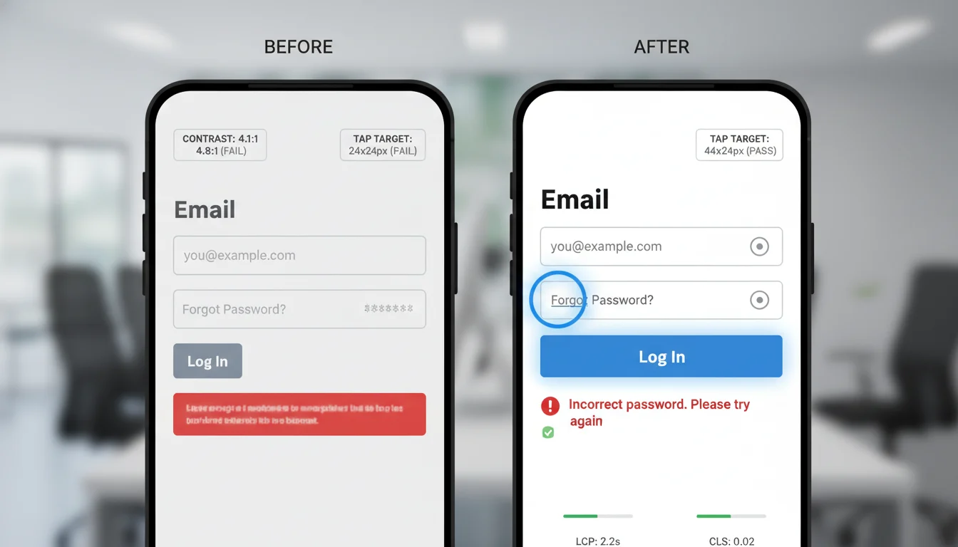
Accessibility and speed are requirements from the first sketch. Every visual system targets WCAG 2.2 AA and follows Core Web Vitals guardrails so your WordPress site is clear, usable, and fast on day one. Bring us your Figma file or current site—we’ll run a quick WCAG + Web Vitals review and hand you a prioritized fix list before pixels become code.
WCAG 2.2 AA from the outset
- Color and type tokens meet or exceed 4.5:1 contrast for body text and 3:1 for large text and UI
- Visible, consistent focus states on all interactive elements
- Keyboard‑first navigation mapped in design (logical tab order, skip links, trap‑free modals and menus, 44×44 px tap targets)
- States and feedback designed without relying on color alone
- Motion respects prefers‑reduced‑motion; non‑essential motion can be removed
Core Web Vitals guardrails in visuals
- LCP: hero media sizes per breakpoint with preload guidance; no heavy above‑the‑fold effects
- CLS: reserved aspect ratios for imagery and embeds; font loading plans prevent shifts (fallback stacks, swap)
- INP: avoid interaction patterns that need heavy JS; targets are responsive and lightweight
Image and video guidelines that ship fast
- Responsive specs for key assets (srcset and sizes ready), 1x and 2x dimensions, safe crops, AVIF or WebP preferred with JPEG or PNG fallback
- Compression targets and asset budgets per template; text remains text, not baked into images
- Native lazy loading for below‑the‑fold media; posters for video; captions and transcripts included; no autoplay with sound; background video disabled on mobile
Animation that respects users and performance
- Use transform and opacity for smooth 60fps transitions; avoid layout‑thrashing properties
- Sensible timing and easing (about 150–300 ms, ease‑out or ease‑in‑out); no infinite decorative loops; reduced‑motion styles provided
Practical budgets and WordPress handoff details
- Per‑template budgets set in design (for example, hero image 200–300 KB; max 2–3 font files or weights; lean critical CSS)
- Tokens and styles map 1:1 to theme.json (colors, typography, spacing), Gutenberg blocks or patterns, and registered image sizes
- Acceptance criteria include contrast checks, keyboard paths, focus visibility, and Lighthouse or Web Vitals thresholds before launch
These standards translate into faster loads, higher engagement, and measurable lifts in real projects. If you already have a design system, we’ll map your tokens to WordPress and prove it with a quick interactive prototype. Ready to make your next launch both inclusive and fast? Schedule a 15‑minute consult or ask us for an accessibility + Vitals audit.
Results you can measure
Great visual design should move the numbers that matter. When hierarchy is clear, spacing is tight, and components point to the right actions, people find what they need faster—and act on it. We’ll agree on KPIs up front (CTA clicks, bounce, form errors, Core Web Vitals) and report back post‑launch so you can see the lift. Want a quick read on your current page? Send a URL for a no‑pitch 10‑minute teardown. For our approach to turning UX into outcomes, see conversion‑focused design.
What clients typically see after a redesign
- Clearer paths to primary actions with fewer competing elements
- Lower bounce rates as pages become more scannable and trustworthy
- More time on page and deeper sessions through readable layouts and purposeful visuals
- Higher completion rates on priority flows (demos, quotes, bookings)
Prefer to validate before you commit? We’ll prototype a key page and run a lightweight test to forecast impact.
Build efficiency you can feel
- Tokenized design (colors, type scale, spacing, radii, motion) mapped to your block theme for one source of truth
- Dev‑ready Figma with specs, states, and acceptance criteria that cut rework
- A component library aligned to Gutenberg patterns that reduces regressions and speeds QA
- Result: faster sprints, fewer design‑related defects, and easier onboarding
Ask for a sample handoff and component library preview to see how clean the build process can be.
Micro‑case snapshots
- B2B services (homepage and pricing). Before: crowded hero, three competing CTAs, inconsistent buttons. After: single primary CTA, simplified nav, standardized buttons. 60 days later: demo requests up 21%, bounce down 18%, time on page up 29%.
- Regional healthcare (mobile appointments). Before: low contrast palette and cramped form spacing. After: WCAG‑compliant contrast, larger type scale, guided steps. 90 days later: mobile bounce down 27%, form errors down 35%, appointment starts up 16%.
- Industrial manufacturer (design system and build). Before: ad‑hoc styles slowed releases. After: tokens to SCSS variables and a mapped block library. Over two sprints: 30% fewer UI regressions, landing page builds 40% faster.
Want to see the proof? Explore the work below for before and after visuals, component snippets, and outcomes. Or book a 20‑minute walkthrough—bring your top page, and we’ll outline quick wins, timelines, and a ballpark budget.
Selected work
Here are recent WordPress projects where our visual systems, component libraries, and theme tokens led to faster builds and better results. If one looks close to what you need, ask us to map the pattern library to your goals—we’ll walk you through how we’d ship it and what it would cost.
Midwest Forge & Fabrication (B2B manufacturing)
- Visual system and custom WordPress theme with a spec table pattern and quote‑request CTA blocks
- Screens show: neutral industrial palette, condensed and mono type pair for data density, button states, services card grid, table styles, iconography
Objectives and outcomes
- Clarified complex services with scannable components and comparison tables
- WCAG 2.2 AA contrast across all UI states; reduced cognitive load on spec‑heavy pages
- Block kit mapped to Gutenberg for case studies, product specs, and RFQ flows; faster publishing
View case study — or request a 10‑minute screenshare to see the RFQ flow and spec table patterns in action.
Archway Pediatrics (healthcare clinic, St. Louis)
- Family‑friendly visual language, appointment‑focused layouts, and accessibility‑first patterns
- Screens show: calming blues and greens, rounded UI, type scale, form styles, alert components, icon set
Objectives and outcomes
- Clear “Book an Appointment” paths with sticky CTAs and clear form states
- Theme tokens tuned for legibility; improved CLS and tap targets on mobile
- Design system handed off in Figma with variants and redlines; clean build parity
View case study — want similar appointment flows? We’ll outline how we’d adapt these patterns to your clinic in a quick call.
Riverfront Realty Group (property search and lead gen)
- High‑contrast UI for listings with reusable card patterns and saved‑search CTAs
- Screens show: brand colors and elevation scale, listing card variants, filter chips, empty and error states, pagination
Objectives and outcomes
- Faster browsing with clear hierarchy on price, beds and baths, and neighborhood chips
- Block patterns for featured neighborhoods and agent bios let marketing assemble pages in minutes
- Performance‑aware imagery guidelines (ratios, lazy‑load) baked into components
View case study — ask for a walkthrough of the listing cards and filter UX tailored to your MLS/data source.
BrewLab Coffee (WooCommerce)
- Warm, editorial look with product storytelling and conversion‑focused cart and checkout visuals
- Screens show: earthy palette, headline and body pair, badge system for roast profiles, PDP gallery, bundled add‑on UI
Objectives and outcomes
- Consistent tokens across PDP, cart, and email modules; fewer visual regressions during promos
- Clear affordances for grind and subscriptions improved add‑to‑cart follow‑through
- Lightweight motion cues (hover, toast confirmations) implemented without jank
View case study — considering a WooCommerce revamp? We can audit your PDP‑to‑checkout flow and share quick wins.
Gateway Community Fund (nonprofit and events)
- Accessible event calendar, donation flows, and content blocks volunteers can update
- Screens show: high‑contrast palette, calendar components, accordion FAQs, form inputs, notification styles
Objectives and outcomes
- WCAG 2.2 AA across navigation, forms, and focus states; keyboard‑friendly components
- Pattern library aligned to Gutenberg groups and columns enables rapid storytelling without a designer on every edit
- Optimized assets and icon font to SVG swap reduced payload and improved LCP on hero pages
View case study — want smoother donations or event management? We’ll show you the exact components we’d reuse.
How we can work together
Choose the model that fits your team, timeline, and stack. Not sure? Book a 15‑minute fit check and we’ll point you to the fastest, lowest‑risk path.
End‑to‑end: strategy, visual design, and custom WordPress build
One accountable partner from discovery to launch. We align on goals, map content and IA, craft your visual system, then hand‑code a high‑performance theme. Built for Gutenberg blocks and patterns, with WCAG 2.2 AA and Core Web Vitals guardrails. We handle QA, content migration, and training so your team owns the site on day one. Ready to scope it? Share your goals and we’ll return a ballpark in 1–2 business days. If you need builders too, explore our Web Development and Custom WordPress Theme Development.
Design‑only with developer handoff and build support
Have an internal dev team? We deliver dev‑ready Figma with tokens mapped to theme.json and CSS variables, responsive states, redlines and specs, accessibility notes, and exportable assets. We stay engaged for design QA, PR reviews, and acceptance to keep pixel parity. Want to see how we document? Ask for a sample handoff kit or a quick walkthrough. Need experienced WordPress builders on call? See our WordPress Specialists.
Redesign within an existing theme (incremental upgrades)
If a rebuild isn’t practical, we audit your theme and plugins, then ship improvements in safe sprints: typography and spacing, color and contrast, component refreshes, asset optimization, and block or pattern cleanup. You get a sharper interface without disrupting traffic. Start with a fast audit and we’ll prioritize the highest‑impact wins first. When you’re ready to implement, our Theme Development process keeps changes stable.
Ongoing visual management: iterations, campaign assets, A/B tests
Keep improving with a monthly or quarterly cadence. We add patterns and templates, create on‑brand hero graphics and campaign assets, run A/B tests with clear hypotheses and tracking, and implement wins while monitoring accessibility and performance. Prefer to try before you commit? Begin with a 60–90‑day pilot. For social and creative support, see AI Social Media Content.
Partnering with branding agencies as a flexible dev/design arm
We translate brand systems into web‑ready component libraries, motion guidelines, and dev‑ready specs, then build or support builds in WordPress. White‑label or co‑branded. We plug into your process, manage Git, staging, and QA, and make handoffs smooth. Let’s compare processes—NDA and sample SOW available on request.
Not sure which model fits? The next section outlines typical timelines and budget ranges so you can scope before we talk. Or skip ahead—request a quick estimate or book a no‑pressure consult and we’ll guide you to the right fit.
Timelines and pricing guidance
What to expect so you can align scope, schedule, and budget. If you’re trying to ballpark your specific project, we can usually give you a tailored estimate and earliest start date after a quick 20–30 minute scoping call. For a deeper dive, here’s how long it typically takes to design and develop a website.
Typical timelines
- Visual system sprint (design language only): 2–3 weeks
- Brand‑aligned color, typography, spacing, buttons, forms, states, tokens, and accessibility foundations (WCAG 2.2 AA)
- Key pages package (system + priority templates): 4–6 weeks
- System sprint plus homepage and 2–4 core templates (for example, services, blog list or post, contact) with responsive states, variants, and specs
- Full site visual design (comprehensive): 6–10+ weeks
- Complete system, 8–20 unique templates, component and pattern library mapped to Gutenberg, motion guidelines, and handoff docs
- If we’re also building your theme: add 4–10+ weeks
- We often overlap design and development after the initial system to shorten the calendar
Notes: Timelines assume clear goals, content readiness, and 1–2 feedback rounds per milestone. Have a fixed launch date? Tell us early—we can propose a phased path or parallel design/dev to help you hit it. Want to confirm where you’d land? Request a quick timeline check.
Pricing ranges
- Visual system sprint: $6,000–$9,500
- Key pages package (system + 3–5 templates): $12,000–$25,000
- Full site visual design (system + 8–20 templates): $30,000–$70,000+
- Add‑ons (as needed)
- Custom iconography or illustration: $2,000–$8,000
- Motion and interaction prototypes: $2,500–$10,000
- Accessibility deep dive (annotations, audits): $3,000–$12,000
- Design + custom WordPress build (for context)
- Small marketing sites: from $45,000
- Complex sites (multi‑language, advanced search, memberships, or light commerce): $80,000–$200,000+
After a short scoping step, we’ll provide a clear proposal with deliverables, timeline, and a fixed investment so you can plan with confidence. Not sure where to start? Many teams begin with the Visual system sprint, then expand.
What influences cost and timeline
- Number of unique templates, breakpoints, and content types
- Custom Gutenberg blocks or patterns and editor experience needs
- Depth of motion and micro‑states
- Accessibility depth (AA vs AA+ with audits and user testing)
- Asset creation (icons, illustrations, photography direction)
- Stakeholder count, decision speed, and revision rounds
- Integrations and technical constraints (existing systems, third‑party platforms)
- Rush schedules or parallel brand work
Share your goals, site map, and any constraints, and we’ll identify the biggest cost/timeline drivers and right‑size the plan to meet your priorities. For launch prep details, see our website launch checklist.
Phased approaches for faster go‑live
- Phase 1: Launch foundation—design system plus priority pages and components that cover most use cases
- Phase 2: Expand—secondary templates, additional blocks, marketing assets
- Phase 3: Optimize—motion polish, accessibility refinements, data‑driven A/B iterations
This lowers risk, spreads investment, and gets value live sooner. Want us to map a phased plan for your launch date? Book a quick planning call.
FAQs
How does handoff to development work and who owns the files?
We design in Figma and deliver a developer‑ready package: component library, design tokens (JSON and CSS variables), redlines and specs, responsive states, motion notes, and accessibility annotations. Components map to Gutenberg blocks and patterns with acceptance criteria for spacing, states, and breakpoints. You own everything. We transfer the Figma source, deliver an asset pack (SVG icons, optimized images, font guidance), and document licenses. If we’re building the theme, we implement tokens in theme.json and SCSS and stay involved through QA and launch. Want to see how tidy this is in practice? Ask for a sample handoff kit or a 15‑minute walkthrough with your dev lead. For go‑live steps, review our website launch checklist.
Can you redesign within our existing theme or component library?
Yes. We start with a visual and technical audit to see what to keep and what to change. If your theme is sound, we refresh styles, expand patterns, and ship updated tokens without a rebuild. If there’s performance or maintenance debt, we propose a phased plan that avoids breaking editor workflows. Not sure which path you’re on? Request a quick audit and we’ll outline the lowest‑risk, highest‑impact next steps. When you’re ready to implement, our Theme Development keeps updates consistent.
What accessibility level do you meet and how do you test it?
WCAG 2.2 AA is our baseline. In design we enforce contrast, visible focus states, touch targets, and readable typography. In testing we run automated checks (axe, Lighthouse, WAVE) and manual reviews for keyboard navigation, focus order, semantics, and zoom or contrast. We spot‑check with NVDA and VoiceOver and document alt‑text guidance and ARIA needs. We can share a sample accessibility checklist and report—just ask.
How do animations affect performance and accessibility?
We use motion to inform, not distract. Animations use transform and opacity for smooth performance, respect prefers‑reduced‑motion, and avoid parallax or scroll‑jacking. Durations and easing stay within readable bounds, and interactive motion never blocks focus or reading. Where motion carries meaning, we provide non‑animated fallbacks and protect Core Web Vitals. Have motion on your current site? We’ll review a page and flag quick wins.
What if we already have brand guidelines?
Great. We translate your brand into a web‑ready system: color tokens with contrast variants, a responsive type scale, spacing, iconography, and usage rules for components and images. If guidelines are print‑first, we adapt them for screens and document any extensions for accessibility and digital consistency. Send your brand PDF and we’ll show how it becomes tokens and patterns in WordPress. Need help with on‑brand visuals? See our Graphic Designer services.
How will our content team maintain consistency in the editor?
We configure WordPress so the right choice is the easy choice: curated presets via theme.json, locked styling where it matters, reusable block patterns for common layouts, and template parts for headers, footers, and CTAs. We add an in‑dashboard style guide, short Loom walkthroughs, and one‑page cheat sheets so editors can move fast without breaking design. Want a peek? We can share a sample editor guide and pattern library. For help managing this long‑term, meet our WordPress Specialists.
Do you collaborate with our in‑house developers or agency partner?
Absolutely. We align on tooling (Figma Dev Mode, Git, issue tracking), review components together before build, and keep a shared backlog for design questions and edge cases. We can work design‑only, build‑only, or full stack, and we’re comfortable in sprint cadences with acceptance and design QA gates. Invite your tech lead to our intro call and we’ll map a clean handoff plan in minutes. If you need additional hands, our Web Development team can plug right in.
Have a question we didn’t cover? Book a 20‑minute consult or request a quick visual audit. We’ll confirm fit, timeline, and next steps—no slideshows, just answers.
Get your free visual audit
Get a practical snapshot of how your site’s visuals help or hurt clarity, accessibility, and conversions—no redesign required. Free, fast, and genuinely actionable so you can make measurable improvements right away.
What’s included
Contrast and hierarchy checks
- WCAG 2.2 AA contrast across text, buttons, links, and focus states
- Typographic scale, heading hierarchy, line length, spacing rhythm, and color usage
- Outcome: clearer scanning, stronger CTA visibility, fewer accessibility blockers
Homepage and key template review
- Homepage hero and primary CTAs
- One core product, service, or landing template
- Blog or article template
- Navigation, footer, form elements, and common mobile states
- Frequently used Gutenberg blocks and patterns
- Outcome: specific, page‑level tweaks that lift engagement without a redesign
Quick wins list
- 8–12 prioritized fixes with impact and effort tags
- Notes on how each change maps to your theme (CSS variables or tokens, block styles, components)
- Lightweight redlines or examples where helpful
- Implementation‑ready—hand to your dev, or we can help knock them out
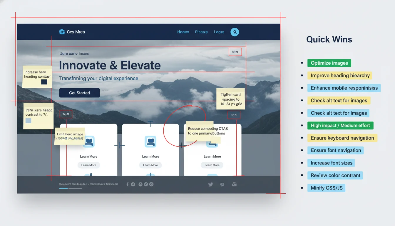
Delivery format and turnaround
- You receive a concise PDF summary (plain‑English, linked recommendations), annotated Figma frames when relevant, and a 10–15 minute walkthrough video you can share with your team
- Turnaround: 3 business days after we confirm scope (we’ll confirm within 1 business day)
- What we need to start: your site URL and top goals; optional read‑only WP or staging access, brand files, and analytics or heatmap access. No credentials required for the free audit—optional access just makes our guidance extra precise.
Call to action
- Request your audit now or book a 20‑minute consult to discuss findings and next steps. No obligation, no hard sell.
Optional download
Sample Visual System Pack for WordPress (gated): a preview set of tokens (color, type, spacing as CSS variables), core components (buttons, inputs, cards, nav), example block styles, accessible focus states, and motion guidelines. Delivered by email after you submit the form—use it as a starting point even if we never work together.
Ready to go? Use the short form below to request your audit or pick a time for a quick consult. It takes about a minute. We’ll confirm your slot and send a firm delivery date.
Start the conversation
Tell us what you’re trying to achieve and we’ll map the simplest path to get there. The form takes about two minutes. We’ll reply within one business day (often same day, Central Time) with practical next steps and a link to book a free 20‑minute consult—no obligation.
What we need to get started
- Name
- Work email
- Website URL
- Goal or priority (dropdown): Launch a new site; Redesign look and feel; WordPress block or design system; Improve accessibility or performance; Create marketing visuals; Ongoing design support
- Message (a few lines about timeline, audience, or hurdles). If you have design files or inspiration, include links (Figma, Adobe, Drive). Not sure which goal fits? Pick the closest and we’ll guide you. Agency partner? Mention “partner” in your note.
What happens next
- We do a quick visual review of your site, brand assets, and goals
- You’ll get 2–3 preliminary recommendations and a scheduling link
- After the call, we send a concise scope outline with timeline windows, budget range, and example deliverables—useful for internal buy‑in. No hard sell, ever.
Client feedback: “Clear, fast, and on‑brand—finally.”
We’re based in St. Louis and support teams across the U.S. and beyond. Your details stay private and are used only to respond. Need an NDA? Just ask.
Ready to make progress on design? Start the form and get your recommendations.
Prefer to browse first? Explore Custom WordPress Development and Ongoing Website Management to see how else we can help. For the fine print, see our Privacy Policy and Terms.