
How Do You Structure Sitemaps, Menus, and Navigation for Usability?
Creating an intuitive and effective navigation system is fundamental for any website aimed at offering a positive user experience. Sitemaps, menus, and navigation structures act as the backbone, allowing visitors to find content quickly and with minimal effort. In this post, we’ll explore best practices, strategies, and principles to structure sitemaps, menus, and navigation systems that enhance usability.
Understanding the Purpose of Sitemaps, Menus, and Navigation
Before diving into how to structure these elements, it’s critical to understand their unique roles:
- Sitemaps: These are hierarchical diagrams or lists showing the overall structure of a website. They serve both users and search engines by outlining how pages are organized and related.
- Menus: The primary pathways through which users navigate your website. Menus categorize and list links to different sections or pages.
- Navigation: The broader system incorporating sitemaps, menus, in-page links, breadcrumbs, and other elements guiding users through the site.
Key Principles for Usable Navigation and Sitemap Structures
Usability in navigation is about making a site intuitive, predictable, and quick to explore. Some vital principles to remember:
- Consistency: Use uniform styles, placement, and naming conventions for menus and links to avoid confusing users.
- Clarity: Navigation labels should be clear and descriptive, avoiding jargon or vague terms.
- Simplicity: Limit the number of menu items and avoid overwhelming visitors with too many choices at once.
- Hierarchy: Structure content logically in a tree-like format, grouping related pages under parent categories.
- Responsiveness: Ensure navigation adapts well for mobile and various screen sizes.
How to Structure Sitemaps for Usability
Sitemaps act as blueprints of the website, useful for both users seeking an overview and for SEO purposes. Here’s how you should approach sitemap structure:
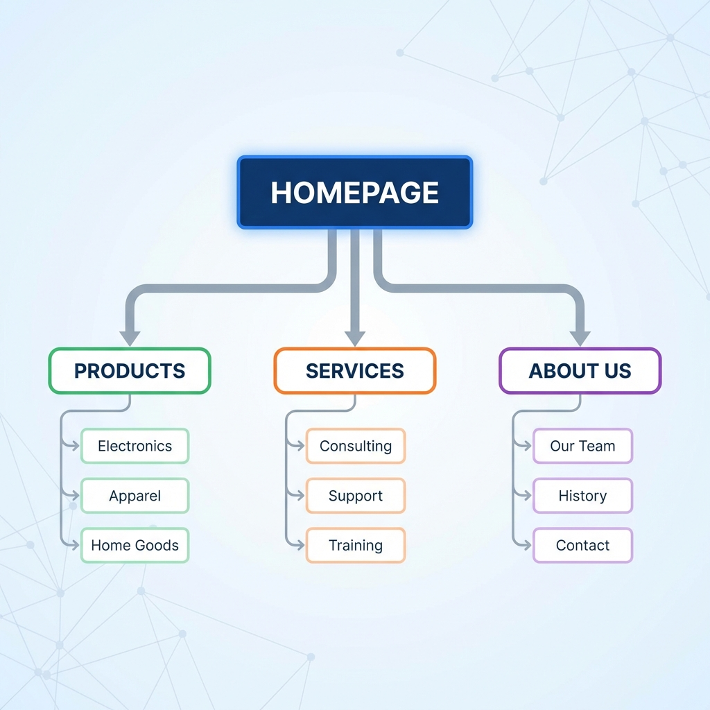
1. Organize Content Hierarchically
The sitemap should group pages from general to specific. For example:
- Home
- Products
- Category A
- Product 1
- Product 2
- Category B
- Category A
- About Us
- Contact
This tree-style blueprint helps in dividing content into manageable sections which feed directly into menu structures.
2. Limit Depth for Accessibility
Deeply nested sitemaps can frustrate users. Ideally, keep the hierarchy no deeper than three levels for ease of navigation. If more layers are necessary, consider implementing search functionality or filtering.
3. Use Visual Sitemaps for Planning
When designing or redesigning navigation, visual sitemaps or flowcharts allow stakeholders to see relationships and identify any overly complex paths or gaps.
Best Practices for Designing Menus
Menus are the gateways to your website content. A well-structured menu increases discoverability and reduces bounce rates.
1. Use Familiar Menu Types
- Horizontal top menus: Commonly used for main navigation with a few categories.
- Vertical side menus: Suitable for content-heavy websites with many sections.
- Hamburger menus: Popular for mobile devices to conserve screen space.
2. Keep Menu Items Manageable
Limit the number of primary menu items to about 5-7. Too many options cause decision paralysis.
3. Use Descriptive Labels
Menu labels should clearly reflect the page content. Avoid creative or ambiguous terms that can confuse users.
4. Employ Dropdown and Mega Menus Wisely
Dropdown menus can save space but should be simple and responsive; mega menus work well for large ecommerce or news websites to display many links while maintaining clarity.
5. Highlight the Current Location
Using visual cues like highlighting or underlining the current menu item helps users understand their location within the site.
Navigation Design Strategies
Navigation encompasses more than menus—it includes additional elements that improve user journey:
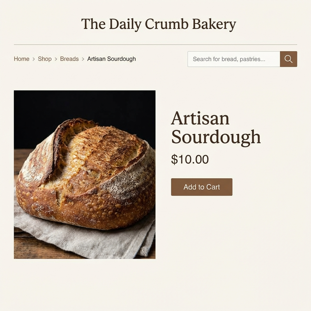
Breadcrumb Navigation
Breadcrumbs provide a trail showing users where they are within the site’s hierarchy, making it easier to backtrack:
- Example: Home > Products > Category A > Product 1
They reduce the need to use browser back buttons and complement main menus effectively.
Search Functionality
Including a robust search bar improves navigation, especially on content-rich sites where menus alone may not be sufficient to locate specific content quickly.
Footer Navigation
The footer can host secondary navigation links, including legal pages, contact details, social media links, and site maps for deeper browsing options.
Usability Testing and Feedback
Good navigation design is iterative. Regular usability testing provides real user feedback on the effectiveness of your sitemap and menus:
- Card sorting: Helps uncover how users group information naturally.
- User task scenarios: Observe how users navigate to complete common tasks.
- Heatmaps and analytics: Identify areas where users hesitate or drop off.
Adjust your structure based on findings to continually improve user experience.
“Navigation is not just about moving through the website, it’s about guiding your users on a journey that meets their goals effortlessly.” – UX Expert
Summary
Effective usability in sitemaps, menus, and navigation comes from thoughtful hierarchy, clarity, and simplicity. By organizing content logically, limiting choices, and leveraging multiple navigation aids like breadcrumbs and search tools, you create a seamless browsing experience for your visitors. Persistent testing and refinement maintain and improve this usability over time, turning your website navigation into a powerful engagement tool.